Search.js
Search.js is a self-hosted JavaScript library for building an interactive search interface on top of the Luigi’s Box Search API.
Include the script, configure the options, and override templates where needed to match your storefront.
Features
Section titled “Features”There is more to search than just search results. Besides support for typical search-related components, such as pagination and sorting, search.js also supports more advanced features.
Faceted search
Section titled “Faceted search”Search.js can power advanced filtering and drill-downs out of the box. Users can search for a phrase, then narrow the results by category, price, brand, and other facets.
Search.js builds facets from your data automatically. You only need to enable them in configuration.
Search across other types
Section titled “Search across other types”You usually have one primary type of content, such as products or articles. Search.js handles that main type and generates facets for it, but it can also show matches from secondary types like categories or brands.
For example, you can search primarily in products while also returning matching categories and brands. A query like “samsung tv” can show product results with product facets, plus separate brand and category matches that are not affected by faceting.
Approximate match results
Section titled “Approximate match results”Great search should be forgiving. Search.js can separate strong matches from approximate matches so you can keep the main result list clean while still surfacing useful alternatives and reducing “no results” dead ends.
Redirecting to category listings
Section titled “Redirecting to category listings”You can configure search.js to skip search entirely when the query matches a category and redirect users to that category listing instead. This is useful when your category pages are already optimized and should take priority over full-text results.
Note that this feature requires that you are indexing a type with a name category.
Custom templates
Section titled “Custom templates”When rendering search results with search.js, you can access all indexed data directly inside the result template. In some cases, though, your rendering depends on data that is not indexed or is difficult to index, such as real-time stock or social proof.
In those cases, you can point search.js to your own rendering endpoint. Search.js will call it with product IDs and render the returned HTML fragments as result tiles.
Banner campaigns
Section titled “Banner campaigns”Search.js automatically renders search banners defined in the Luigi’s Box app. Once you define the trigger phrases and banner assets, they appear without additional frontend work.
Query rewrites
Section titled “Query rewrites”Search.js can also render query rewrites and any accompanying message defined for them.
Integration
Section titled “Integration”This setup sends users to a dedicated search page when they submit a query, then lets Search.js fetch results and render the full search UI there.
Example layout for the /search page:
<html> <body> <nav></nav> <input type="search" name="q" id="q" /> <div id="search-ui"> <!-- empty placeholder for search UI, styled with a loading indicator --> </div> <footer></footer> </body></html>1. Create the search page
Section titled “1. Create the search page”Create a new HTML page such as /search that uses your standard layout and contains a placeholder where Search.js will render the UI. The placeholder should show a loading state. See Loading states for details.
2. Point search forms to the new page
Section titled “2. Point search forms to the new page”Update your existing search forms to submit to the new page using the GET method. When users press Enter or click the search button, they should land on the page from step 1 with the query stored in the URL.
The simplest approach is to wrap each search field in a <form> whose action points to the page from step 1. For example: <form action="/search"><input name="q" type="search"></form>
If your search fields are already inside a <form>, update its action and make sure it submits via GET.
3. Initialize Search.js
Section titled “3. Initialize Search.js”Include the script and set configuration parameters.
<script type="text/x-template" id=".."></script><script type="text/x-template" id=".."></script>
<!-- Make sure that you define your templates before you load the search.js script --><script src="https://cdn.luigisbox.com/search.js"></script><script>  Luigis.Search(    {      TrackerId: "2291-22343",      Theme: "boo",      Size: 20,      Personalization: true,      Facets: ["brand", "category", "price_amount"],      DefaultFilters: {        type: "item",      },      UrlParamName: {        QUERY: "q",      },    },    '[name="q"]',    "#search-ui",  );</script>
Please note that:
- You must define your templates before you initialize search.js script. Templates are looked up when search.js initializes and when they are not present in the page at that time, search.js will fall back to the default built-in templates.
- You must initialize the search by calling
Luigis.Search. The initialization function takes 3 arguments: configuration object, CSS selector for the input element and CSS selector for the placeholder element where it will render the Search UI. - You must define the initialization script (call to
Luigis.Search) in the HTML after the search input element and after the placeholder element. The script expects to find both elements on initialization. - It is important that the search form input
nameparameter matches the query parameter (UrlParamName.QUERY) in configuration.
Without defining custom templates, you will get a very simple and unstyled search UI. You will most likely want to define custom templates where you can reuse your existing styles.
If you define the templates to match the HTML you are using today, there should be no extensive styling necessary.
Content security policy
Section titled “Content security policy”If your website is using Content Security Policy, you need to add following rules to allow Luigi’s Box search.js to work.
| CSP directive | Value |
|---|---|
connect-src | https://live.luigisbox.com |
script-src | https://cdn.luigisbox.com |
Options reference
Section titled “Options reference”Luigis.Search accepts these arguments:
| Option | Comment |
|---|---|
TrackerId required | Identifier of your site within Luigi’s Box |
Theme optional | Theme controls the visual style of the search UI. Search.js currently supports 3 themes: 'default', 'luigis' and 'boo'. We recommend that you start your integration with 'boo' theme, and override template / style with CSS only what is necessary. See Theming for more details. |
Size optional | Specifies how many results should the API return in each request (default: 10) |
Personalization optional | Boolean, indicating whether to personalize search results (default: false). Personalization is based on the data collected by the tracking script. If you enable this option, make sure that you have installed the tracking script on your site and that it is collecting data. |
ResultsRenderer optional | Accepts either a JavaScript function or a URL string to take over the rendering of product tiles. If a function is provided, it handles the rendering client-side and must return a Promise (see Frontend results rendering). If a URL is provided, search.js invokes it via GET, replacing the ${product_ids} placeholder with comma-separated IDs (see Backend results rendering). |
Facets optional | Array of default facets requested in every search request. See Faceting for more details. |
DynamicFacetsSize optional | Number of dynamic facets or string with two numbers delimited by colon, for example 2:5 which will render max of 2 dynamic facets, each with max 5 options, other options will be hidden with “show more” option, (default: null). See Dynamic facets for more details. |
DefaultFilters optional | Object with key/value pairs. Value can be string or array of strings. You can use this to setup a default search filters, regardless of user’s selection in the search UI. See Default filters for more details. |
Prefer optional | Array of key/value pairs to use for query-time boosting. |
DefaultSort optional | Sort specification in format field:direction, where field is the field name that you want to sort on, and direction can be either asc or desc. |
Sorts optional | Array of sort specifications in format field:direction, where field is the field name that you want to sort on, and direction can be either asc or desc. If the theme supports sorting (the luigis theme does), it will render a sorting component allowing users to sort results by these fields. |
FacetsOrder optional | Object with facets names as keys. It will determine order of values in facets. See Sorting facet values for more info. |
QuicksearchTypes optional | Array or string of types to run quicksearch on. This is useful for showing hits in categories or brands. |
UrlParamName optional | Sets the URL parameter names. This is useful if you want to preserve your existing URLs, because you can map your existing URL parameters to search.js parameters. |
BaseUrl optional | String containing base url used to redirect to when in-place search triggered. Prefer a relative url. (default: page origin) |
OnDone optional | A function called after results are rendered (even when ResultsRenderer is used). |
SeparateExactResults optional | Boolean indicating whether to separate exact results from non exact (default: false). When set to true, you need to add <additional-results> component to template to show non exact results. |
FollowSuggestedUrl optional | Boolean indicating whether to redirect users to a matching category (default: false). |
Locale optional | String, indicating a locale identifier which will setup the default translations and price format. See Localisation for more information. |
HitFields optional | Array of strings specifying which catalog attributes to include in the API response. Use this to reduce response size and improve performance. When not set, all attributes are returned. (default: undefined) |
Translations optional | Object, including translation keys and translation themselves. See Localisation for more information. |
PriceFilter optional | Object, including configuration for price formatting. See Localisation for more information. |
ActiveAnywhere optional | Boolean, indicating whether to activate search on any subpage where the search query parameter is present. (default: false, search is activated only on BaseUrl). |
TopItems optional | Array of {type}:{count} strings to generate top items displayed in no results template. To disable displaying top items in no results template use TopItems: []. See Top items for more information. |
QueryUnderstanding optional | Boolean indicating whether to automatically try to recognize filters (default: false). |
Variant optional | String, used for adding _SearchVariant filter into JSON+LD (default: ''). |
IsSPA optional | Boolean, set to true if page is Single Page Application (e.g. turbolinks) and Luigis.Search() is called more than once without page reload (default: false). |
ModifyRequestParams optional | Function to modify params of API call which receives (params, state, getters) parameters, must return modified params object (default: undefined). |
SingleChoiceFacets optional | Array of strings with facet names which will only allow the user to select a single option. See Single choice facet. Only applicable to boo theme. |
CollapsedFacets optional | Array of strings with facet names which should be collapsed by default. Only applicable to boo theme. |
PostponeDataCollection optional | Boolean indicating whether data collection should be postponed after the OnDone function is called. See Postponing data collection for more information. |
Luigis.Search also accepts two mandatory CSS selectors:
Search input:
[name="q"]: Selector for search input. This will trigger search when enter key is pressed in the selected input field, OR if the parent form is submitted.
Search element:
#search: Id selector for element where Luigi’s Box search component should be rendered.
Templates
Section titled “Templates”Luigi’s Box Search.js is using templates to render the Search UI. While we include all templates in the default search.js distribution, they are not styled. Usually, you will want to define your custom template which matches the styling of your site. Templates are using Vue.js template syntax under the hood.
You should define these templates directly in your HTML code. Each template must be defined in its own <script type="text/x-template"> tag. Templates are looked up by their id attribute — make sure to not change it. You don’t have to redefine every template, only those that you will actually use.
In each template you have access to these variables which you can use to adjust the layout:
isLoading: Boolean, true if search.js is waiting for Luigi’s Box API response.isInitialLoading: Boolean, true if search.js is waiting for first load of Luigi’s Box API response.isNoResults: Boolean, true if search returned 0 hits.
Search template
Section titled “Search template”Example of a main search template:
<script type="text/x-template" id="template-search"> <div class="row"> <div class="col-4"> <facets></facets> <banner position="panel"></banner> </div> <div class="col-8"> <h1>Search results for query "{{ query }}", {{ hitsCount }} results</h1> <div v-if="correctedQuery"> We have modified the search phrase for you: {{ correctedQuery }} </div> <div class="pull-right"> <sort></sort> </div> <loading></loading> <banner position="header"></banner> <quick-search type="brand"></quick-search> <quick-search type="category"></quick-search> <results></results> <pagination></pagination> <banner position="footer"></banner> </div> </div></script>This is the root template used for rendering search layout. Use this template to define how your Search UI should look and which features it should support. Should it support faceting and sorting? Should the pagination component go above or below search results?
You have access to correctedQuery property. Luigi’s Box Search API corrects typos and optimizes search query automatically, you can show these changes to your visitors.
You can reference these main components:
<facets>: Facet component which will render faceting (filtering) controls.<sort>: Sort component, which will render sorting controls.<loading>: Loading component, which will indicate that search results are loading.<results>: Results component, which will render results.<additional-results>: Optional. You need to define this if you want to include “Did you mean?” results.<pagination>: Pagination component, which will render pagination controls.<quick-search>: Quicksearch component, which will render “search also in” results.<banner>: Banner component, applicable only if you are using Luigi’s Box banner campaigns. If you are missing this component in the main search template, banner feature will not work. The<banner>component takes apositionparameter, which specifies which banner position to use. Valid values are:header,footerandpanel. Note that the banner inside results is rendered as part of the<result>component.
Facets component
Section titled “Facets component”Example of a facets component definition:
<script type="text/x-template" id="template-facets"> <div> <facet :facet="facet" v-for="(facet, i) in facets" :key="i"></facet> </div></script>Referenced as <facets>.
Used for generating list of facets. The default definition will render each facet in a separate div. Override this template if you want to render facets in a custom structure, such as <ul> list.
| Name | Description |
|---|---|
facets | Array of facets |
To render a single facet reference <facet> component. <facet> component is a special component that will detect facet type and render a template designed specifically for that component. The <facet> component accepts these arguments:
| Name | Description |
|---|---|
:facet | A facet object |
:key | Recommended unique value. Used for better performance while rendering. See Vue key |
Note that you have to explicitly ask for the facets to be generated by setting the Facets initialization option.
Multichoice facet
Section titled “Multichoice facet”Example of a multichoice facet template:
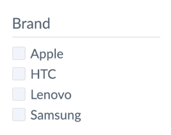
<script type="text/x-template" id="template-facet-multichoice"> <div class="lb-facet-multichoice"> <h1>{{ name }}</h1> <ul class="lb-facet__list"> <li v-for="val in values"> <label> <input v-model="val.used" type="checkbox"/> {{ val.value }} ({{ val.hits_count }}) </label> </li> </ul> </div></script>Multichoice facet is the most common facet type. It represents a filter that can take multiple choices at the same time. A “brand” facet is a good example: users can search for “phone” and then tick “Apple” and “Samsung” in the brand facet to search only for Apple or Samsung phones.
| Name | Description |
|---|---|
name | Facet name. Note that this is the field name (in your source data) and not a human readable label so you will need to translate it for display |
values | Array of objects with histogram data |
values.hits_count | Number of results that will remain when users selects this choice. This value is computed from the current query and values of all other active filters |
values.value | Choice value |
values.used | Boolean flag indicating whether this choice is selected |
A multichoice facet can behave as singlechoice facet by setting the SingleChoiceFacets option.
Both facet names and values can be translated using the Translations mechanism.
To translate facet name use the facet.name.$name path in the translation json, e.g.
Translations: { en: { facet: { name: { "brand": "Manufacturer", "availability_rank_text": "Availability" } } }}To translate facet value use the facets.values.$facet_name.$value_name path in the translation json, e.g.
Translations: { en: { facets: { values: { availability: { "0": "Out of stock", "1": "In stock" } } } }}Range facet
Section titled “Range facet”<script type="text/x-template" id="template-facet-numeric-range"> <div class="lb-facet-range"> <h1>{{ name }}</h1> From {{ min }} - To {{ max }} ({{ value }}) <vue-slider :min="min" :max="max" v-model="value" @callback="callback"></vue-slider> </div></script>Range facet allows you to build a slider-like filtering component. Range facets are most commonly used for prices, where users can select their acceptable price range by adjusting a slider.
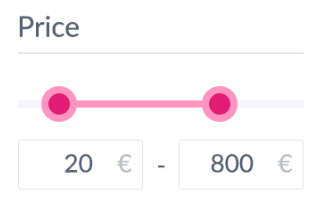
Range facet is automatically built from your numerical attributes. When your source data includes integer or floating point attribute and you request a facet for it, we will automatically build a range facet.
Search.js bundles a <vue-slider> component which you can use to easily build a slider.
Template parameters
Section titled “Template parameters”| Name | Description |
|---|---|
name | Facet name. Note that this is the field name (in your source data) and not a human readable label so you will need to translate it for display |
min | The minimal value of this attribute with respect to other facets and query. You may have a product priced at $1, but when the user sets, for example, a brand filter to “Samsung”, then the minimum value will be the minimum price of Samsung products. |
max | The maximum value of this attribute with respect to other facets and query. |
value | Currently selected range encoded as the 2-elements array. The [0] element is the range lower bound, [1] is the range upper bound. |
callback | Function that you need to call after the user changes the range to trigger search. If you are using the bundled <vue-slider>, then pass the callback as @callback. |
Date facet
Section titled “Date facet”Example of a date facet template:
<script type="text/x-template" id="template-facet-date"> <div class="lb-facet-date"> <h1>{{ name }}</h1> {{ dates }} <div> Smaller than<br> <button @click="onDateChange({dates, options: {smallerThan: true}})">get</button> </div> Exact day: <lb-datepicker id="datepicker" :dates="dates" @change="onDateChange"></lb-datepicker> Bigger then: <lb-datepicker id="datepicker" :dates="dates" @change="onDateChange" :options="{biggerThan: true}"></lb-datepicker> Range: <lb-datepicker id="datepicker-range" :dates="dates" :options="{mode: 'range'}" @change="onDateChange"></lb-datepicker> </div></script>Date facet allows you to build a calendar-based filter. Date facets are automatically built from your source data attributes which contain date values.
Search.js bundles a custom <lb-datepicker> component which you can use to build a user-friendly calendar selection filters.
Template parameters
Section titled “Template parameters”| Name | Description |
|---|---|
name | Facet name. Note that this is the field name (in your source data) and not a human readable label so you will need to translate it for display |
dates | Currently selected date range encoded as the 2-elements array. The [0] element is the range lower bound, [1] is the range upper bound. |
onDateChange | Function that you need to call after the user changes the date range to trigger search. If you are using the bundled <lb-datepicker> component, then pass the callback as @change. |
Luigi’s Box datepicker component
Section titled “Luigi’s Box datepicker component”Component invocation:
<lb-datepicker id="unique-id" :options="optionsObject" @change="onDateChange"></lb-datepicker>The <lb-datepicker> supports 2 different modes, integrated with the Luigi’s Box Search API so you can just set the mode and search.js will send the correct search API request:
- Single date mode, where a user can pick a single date which will be interpreted as an exact match on the backing date field.
- Range mode, where a user can pick two dates in calendar which will be interpreted as a range query in search, that is, search.js will make a request to Luigi’s Box Search API and add conditions that the attribute value must be within the date range selected in the component.
The range mode can be furthermore specialized to:
- Later than mode, where a user can pick a single date and search.js will make a search request and specify that the attribute value must be bigger than (later than) the selected date.
- Sooner than mode, where a user can pick a single date and search.js will make a search request and specify that the attribute value must be sooner than (smaller than) the selected date.
Options object example:
{ dateFormat: 'Y-m-d', // Displayed date format mode: 'range' // If you want to select multiple dates biggerThan: true, // Optional, set to true to turn on the *Later than* mode smallerThan: true, // Optional, set to true to turn on the *Sooner than* mode}| Name | Description |
|---|---|
id required | Each datepicker must have a unique ID. |
options | JavaScript Object with options. See full reference above. |
Using custom datepicker component
Section titled “Using custom datepicker component”If you want to use your custom date picker component, make sure to call the onDateChange callback to trigger search. The function takes a single Object argument with 2 keys: dates and options.
Example onDateChange to execute range search:
onDateChange({ dates: [new Date("2018-01-20"), new Date("2018-12-31")],});Example onDateChange to execute later than search:
onDateChange({ dates: [new Date("2018-01-20")], options: { biggerThan: true, },});Example onDateChange to execute sooner than search:
onDateChange({ dates: [new Date("2018-01-20")], options: { smallerThan: true, },});| Name | Description |
|---|---|
dates | Array. In range mode, use 2 values to denote interval. In later than or sooner than mode use an Array with single date. |
options | None for single and standard range search. {biggerThan: true} for later than search, {smallerThan: true} for sooner than search. |
Boolean facet
Section titled “Boolean facet”Example of a boolean facet template:
<script type="text/x-template" id="template-facet-boolean"> <div class="lb-facet-bool"> <label> {{ name }} ({{ hits_count }}) <input v-model="value" type="checkbox"/> </label> </div></script>Boolean facet is useful for filtering on boolean attributes. Boolean facet is automatically generated for all boolean fields in your source data.
It is often used for “In stock” or “Free shipping” filtering.
Note, that the semantics of the boolean facet is that it can be used to filter for “true”-ness of an attribute, or no filtering at all. If you have an “In stock” facet, rendered as checkbox:
- when the user checks the checkbox, search.js makes a search request requiring that returned items are “in stock”
- when the checkbox is not checked, search.js does not filter by that attribute at all and displays items regardless of whether they are, or are not in stock.
| Name | Description |
|---|---|
name | Facet name. Note that this is the field name (in your source data) and not a human readable label so you will need to translate it for display |
hits_count | Number of results that will remain when users selects this choice. This value is computed from the current query and values of all other active filters |
Hierarchical facet
Section titled “Hierarchical facet”This type of facet is very similar to Multichoice facet, but it has multiple levels that respect hierarchy and can be collapsed or expanded as needed for better UX.
Right now, this facet type is only available for category_path facet. If your data feed is structured correctly and items contain hierarchical information about their respective categories (ancestors), this facet is available to you. Maximum of 3 levels is currently supported.
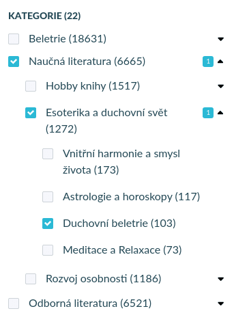
Template for this facet is fairly complicated. If you absolutely need to customize it, contact us for more information.
Sort component
Section titled “Sort component”Example of a sort component template:
<script type="text/x-template" id="template-sort"> <div> <a href="#" v-if="sortBy === 'price'" class="lb-sort lb-sort--active" :class="'lb-sort--' + sortDir" @click.prevent="doSort('price:' + sortDirReverse)"> Price {{ sortDir }} </a> <a href="#" v-if="sortBy !== 'price'" class="lb-sort lb-sort--asc" @click.prevent="doSort('price:asc')"> Price </a> </div></script>The sort component allows you to build a UI element where users can change the way the search results are sorted.
When building a sort component, you must decide the attributes which you want to sort on. Our recommendation is to keep things simple and keep “less is more” on your mind.
When you don’t specify any sort parameters, Luigi’s Box Search API will order the results by our proprietary sorting algorithm, which in many cases is all you need. Often times, sorting is used as a workaround in the absence of more powerful faceting functions. Take for example “Sort by availability”. You can provide vastly enhanced user experience and convenience when you implement this as an “availability” facet. This way, your users can instantly see how many items are in stock, how many are ready for immediate shipment, how many are unavailable, etc., and they are able to drill down to specific availability states they are interested in, while also keeping the filtered items sorted by relevance.
Template parameters
Section titled “Template parameters”| Name | Description |
|---|---|
sortBy string | Name of the attribute the results are currently sorted by. This can be null if no explicit sort was requested. |
sortDir string | Sort direction (asc/desc) currently in use. |
sortDirReverse string | Reverse sort direction (desc/asc). This is mainly for convenience as you don’t have to reverse the sort direction manually. |
doSort function | Call this function to execute search with the requested sorting parameters. |
Loading component
Section titled “Loading component”Example of a loading component template:
<script type="text/x-template" id="template-loading"> <div v-if="isLoading"> LOADING ... {{ isLoading }} </div></script>Loading component is visible only during the time we are requesting resources from external APIs. This includes calls to Luigi’s Box Search API to retrieve the results and (if you are using it), calls to your own ResultsRenderer API.
This component is mainly useful if you want to provide a global loading indicator, such as an overlay over search results with a spinner animation.
You can also access special variables in any of the components:
isLoadingto see whether app is waiting for external APIisInitialLoadingto see whether app is loading for the first time.
Having the isLoading flag available in every component allows you to build very flexible loading states. Want to fade out the Search UI on loading? Use a v-if="isLoading" on the main Search template to set a specific CSS class. Want to replace facet templates with a loading animation for each facet? Use a v-if="isLoading" in the Facet template to render a different HTML when loading.
Results component
Section titled “Results component”Example of a results component template:
<script type="text/x-template" id="template-results"> <div> <result :result="result" v-for="(result, i) in results" :key="i"></result> </div></script>Referenced as <results>.
Used for rendering search results.
Template rendered when no results were found:
<script type="text/x-template" id="template-no-results"> <div class="lb-no-results"> No results found </div> <top-items></top-items></script>Note that in case the Search API returns no results, search.js will render template with id template-no-results.
Template parameters
Section titled “Template parameters”| Name | Description |
|---|---|
hitsCount | Number of search results in total (including those that are not displayed and only accessible via pagination) that are matching the queries and filters. |
results | Array of search results that you should individually pass to a <result> component via its :result property. |
Single result component
Section titled “Single result component”<script type="text/x-template" id="template-result-default"> <div class="lb-result-default"> {{ attributes.title }} - {{ url }} </div></script>Referenced as <result>.
Use this component to render a single product representation. You can directly reference all attributes that you have indexed for this type of content.
For convenience, each result can have the template based on its type. If the result is of type product, template engine will search for template id template-result-product, and if not found fallback to template with id template-result-default.
<script type="text/x-template" id="template-result-{type}"> <div> Result {{ type }} </div></script>Additional results component
Section titled “Additional results component”Referenced as <additional-results>.
Used for displaying additional results only when SeparateExactResults option set to true. When set up, then:
<results>component will display only results found via exact match.<additional-results>component will display items found via approximate matchexact: false.
When there are no approximate matches, then this component will not be rendered. When all matches are approximate, then by default all of them will be rendered inside <results> component.
<additional-results> <h2>You may also like</h2> <div slot="after">Show after additional results</div></additional-results>Content wrapped inside <additional-results> will be displayed before additional results. You can use this to show a title. You can use a special “after” slot marker to display content after additional results, for example, <div slot="after">.
Since this content is wrapped inside the component template it is not shown when the component is not shown, for example, when there are no approximate matches.
This component is using the same mechanism and templates as the <results> component.
If you are using ResultsRenderer, then the product representation will be generated by your external ResultsRenderer API via a separate API call. If part of your search result hits are exact and part is approximate, search.js will call the ResultsRenderer endpoint twice. You should consider this additional load in your capacity planning.
Pagination component
Section titled “Pagination component”Referenced as <pagination>.
Used for displaying pagination component. Search.js only supports the “next-page” style pagination where users can request another page of results and the next page of results is appended to the already displayed results.
<script type="text/x-template" id="template-pagination"> <div class="lb-pagination"> <a href class="lb-pagination__pager lb-pagination__next" v-if="isNextPage" @click.prevent="nextPage" > Load page {{ page }} </a> </div></script>| Name | Description |
|---|---|
page integer | Next page number. |
isNextPage boolean | Indicates whether a next page of results is available. |
nextPage function | Call this function to trigger loading of next page of results. |
”Also search in” component
Section titled “”Also search in” component”Referenced as <quick-search>.
<script type="text/x-template" id="template-quick-search-{type}"> <div v-if="items.length > 0"> Quick search name <div v-for="item in items"> {{ item.attributes.title }} - {{ item.url }} </div> </div></script>Displays matches within additional types if QuicksearchTypes option is present. These templates are scoped to specified type. Each type must have its own template with the type name embedded in the template id. E.g., if quicksearch type is brand, template engine will search for template-quick-search-brand.
| Name | Description |
|---|---|
items array | Array of quick search results for current type. You can access the indexed attributes directly on each array element. |
Recipes
Section titled “Recipes”Theming
Section titled “Theming”Search.js comes with 3 themes which control the visual style of the search UI.
boo- which will give you a full-featured and nicely styled search, facets and more modern look. Use this theme, unless you have special requirements and plan to implement the search UI yourself from scratch.luigis- which will give you a full-featured and nicely styled search. This used to be default theme, now deprecated in favor of “boo”.default- which is a barebone visual style, which only provides a very basic and unstyled UI. If you plan on implementing all templates by yourself, use this template.
When using the boo or luigis template, you should also set the Facets and Sorts options, to get built-in faceting and sorting support. In our experience, you will usually want to override the template for result tile (template-result-default), based on the product data that you have available.
Localisation
Section titled “Localisation”Localisation is controlled by 2 parameters: Translations which contains the translation keys and translated strings and PriceFilter, which controls the price format. There is also a 3rd parameter — Locale which just sets up built-in translations and price formats.
When localising the search UI, we recommend that you configure Locale to load the defaults and then adjust translations or price format as necessary.
The locales supported out of the box are:
- Bulgarian (bg)
- Czech (cz)
- German (de)
- English (en)
- Croatian (hr)
- Hungarian (hu)
- Polish (pl)
- Romanian (ro)
- Slovenian (si)
- Slovak (sk)
To load the default locale settings, use the country code, for example Locale: 'de'.
Translations
Section titled “Translations”Translations are configured as a JavaScript object (JSON). Note that the object that you pass to Translations is merged with the built-in translations. You can add new translations, you can override built-in translations, but you cannot delete a translation.
The Translations object must include the locales as the top-level keys. Note that you don’t have to define the translation for all supported locales, but only for those that you care about.
For example, to override translation for pagination button, set Translations: {"en": {"pagination": {"nextPage": "More results"}}}.
Some translations support dynamic parameters, those are indicated with colon-started variables in the built-in translation. E.g., the default translation for search title is Results for :query (:hitsCount) — where :query will be replaced with the current query and :hitsCount with number of hits. See the built-in translations to see where a dynamic parameter is supported.
The translations configuration is flexible enough to allow you to configure translations which depend on configuration in other parts of the search UI, namely: faceting, quicksearches and sorting. The localisation of all these 3 features depends on how you configure them and on your exact attributes in your data. For example, you can configure faceting on attribute called customer_rating_stars by setting Facets: ['customer_rating_stars']. When search.js renders the facet, it will automatically try to lookup the facet title as facet.name.customer_rating_stars inside the translations. If it finds such key, it will use the translation, otherwise, it will fall back to the attribute name (customer_rating_stars in this case).
To provide custom facet name, set:
Translations: { "en": { "facet": { "name": { "customer_rating_stars": "Customer rating" } } }}If necessary, you can access the translation mechanism by calling a trans function from within the search.js templates. Pass it the translation key as an argument, for example trans('pagination.nextPage').
Default English translations
{ "activeFilter": { "remove": "Cancel" }, "activeFilters": { "title": "Used filters", "cancelAllFilters": "Cancel all filters" }, "additionalResults": { "title": "You may also like" }, "error": { "title": "The server is currently unavailable, sorry!", "titleAgain": "An unexpected error has occurred, we are trying again." }, "facet": { "name": { "brand": "Manufacturer", "category": "Catalogue", "details": { "value": "Detail", "values": "Detail" }, "price": "Price", "price_amount": "Price" }, "multichoice": { "showMore": "More (:count)", "showLess": "Hide others" } }, "facetDate": { "smallerThan": "Before", "exactDay": "Exact day", "biggerThan": "After", "range": "From-To", "get": "get" }, "facetNumericRange": { "changed": "We couldn't find any results in the price range you chose", "from": "from", "to": "to", "histogramBucketTitle": ":count" }, "facets": { "closeFilter": "Close" }, "loading": { "isLoading": "Loading ..." }, "noResults": { "noResults": "We couldn't find any suitable results" }, "pagination": { "nextPage": "Load more" }, "quickSearch": { "title": { "category": "Categories", "brand": "Brands" }, "topItemTitle": { "category": "Top categories", "brand": "Top brands" } }, "resultDefault": { "actionButton": "Detail", "availability": { "0": "Unavailable" }, "result": "Result" }, "search": { "title": "Results for :query (:hitsCount)", "titleShort": "Search", "filter": "Filter", "queryUnderstanding": { "title": "We detected the following filters", "cancel": "Repeat without automatic filter detection" } }, "sort": { "availability": "Availability", "price": "Price", "price_amount": "Price", "name": "Name", "title": "Name", "headlineTitle": "Sort by: " }, "site": { "title": "Search", "titleResults": "Results for :query (:hitsCount)" }, "topItems": { "title": "You might be interested", "results": { "title": "Top products" } }}Price format
Section titled “Price format”Price format is controlled by a price filter, which is automatically called from within the default templates, such as {{ attributes.price_amount | price }}.
You can control the price filter options by setting PriceFilter parameter in the configuration options.
PriceFilter: {"decimals": 0, "prefixed": false, "symbol": "CZK"}| Option | Description |
|---|---|
decimals | Specifies rounding precision |
prefixed | Boolean, specifies if the price symbol should be displayed before or after the price ($42 or 42$) |
symbol | The currency symbol |
Faceting
Section titled “Faceting”Faceting (also known as filtering or aggregations) allows you to build a more powerful Search UI — one that makes it possible for the user to drill down the results and further refine their query.
For example, a user may enter “wireless earbuds” and get back thousands of results. Facets allow the user to see “groupings” of results, to see that of those thousands, there are products made by Apple, HTC, Lenovo, Samsung. Now the user can click on “Apple” in the facet and see just those “wireless earbuds” which are made by Apple.
There are usually more facets, and the crucial property that allows effective filtering, is that the facets are linked together. If there is a facet for “brand” and a facet for “color”, and the user selects “Apple” in the brand facet, then the “color” facet must respect that choice and only show colors for “wireless earbuds” made by “Apple”. This linking works for unlimited number of facets — all facets respect choices in other facets and allow the users to effectively explore and browse the results.
Example Facets configuration:
Facets: ["brand", "category", "color", "price_amount"];To implement facets in search.js, start by configuring the Facets configuration option. It is an array of attribute names, from which you want to build the facets.
Reload the page and if you are using luigis theme, you should see a nice search UI with 4 facets in the left column — one facet for each attribute in the Facets array. Search.js will automatically render correct template for each facet type:
- Multichoice facet for string attributes
- Range facet for numeric attributes
- Boolean facet for boolean attributes
- Date facet for date attributes
Besides configuring Facets, you may also need to configure more human readable facet titles. Search.js will attempt to translate the facet names via its standard translation mechanism, but when it does not find a translation, it will use the attribute name as facet title.
Locale: "en";To get more human readable facet titles, start by configuring Locale in initialization options.
Then configure translations for facet titles by settings Translations initialization options.
Translations: { "en": { "facet": { "name": { "brand": "Brand", "category": "Category", "color": "Main color", "price_amount": "Price" } } }}The Facets configuration also supports a special syntax which will (if the theme supports it) show a limited amount of facet values, and allow the user to expand the list.
Facets: ["brand:5", "category:3", "color"];If you suffix the attribute name by a colon followed by a number, luigis theme will understand this as a collapsing instruction and show a limited number of facet values, followed by a link to expand more values. If you want to customize the expansion link, configure the text via a standard translation mechanism.
Translations: { "en": { "facet": { "multichoice": { "showMore": "More (:count)", "showLess": "Hide others" } } }}Sorting facet values
Section titled “Sorting facet values”Facet values are sorted by number of potential hits by default. There are some cases where there’s a more natural ordering, such as apparel sizing or product availability. Since the “natural” ordering of the values in general is very specific, you must use FacetsOrder option or re-sort the facet values in the facet template.
FacetsOrder option
Section titled “FacetsOrder option”Pass FacetsOrder option when initializing Search.js. This option accepts object with facets names as keys. Values can be following strings: hits, alphabetical or sizes. You can also pass custom sort function as value.
If some facet is not defined in this object, or hits is passed as value, default sorting is used.
Luigis.Search({ // other options, FacetsOrder: { brands: 'alphabetical', sizes: 'sizes', colors: (a, b) => a.value - b.value, }}, ...)Dynamic facets
Section titled “Dynamic facets”For stores with a product portfolio spanning several verticals, selecting filters to display with search is a very challenging problem. When searching for “lightbulbs” you want the users to be able to filter on “Energy efficiency”, while searching for “office chair”, you want a filter on “Material”. Luigi’s Box dynamic facets streamline and automate the filter selection process. You simply enable dynamic facets, set the number of desired facets and the API will use an AI model to select the most appropriate filters for every query.
The selection is driven by 2 different characteristics:
- Statistical properties of the data, for example, selectivity of the filters.
- Feedback from search analytics — the filters that are being used more will bubble up to higher positions.
The filter selection process will get more smart over time, as it adapts to user behavior. Note that this feature enables additional AI model which is not being trained by default. If you plan to use dynamic faceting, get in touch with us at support@luigisbox.com.
Rendering 10 facets, selected by Luigi’s Box AI:
Luigis.Search({ // other options, DynamicFacetsSize: '10'}, ...)Rendering 10 facets, each showing the first 8 options and the rest available via “Show more”:
Luigis.Search({ // other options, DynamicFacetsSize: '10:8'}, ...)Mixing explicit and dynamic facets:
Luigis.Search({ // other options, Facets: ['price_amount', 'category'], DynamicFacetsSize: '5'}, ...)Single choice facet
Section titled “Single choice facet”Luigis.Search({ // other options, Facets: ['price_amount', 'category', 'labels'], SingleChoiceFacets: ['labels']}, ...)The builtin behavior for string/text facets is to enable multiple selections, with an implicit “OR” boolean operator between individual values. For certain use-cases, you may want to enable only a single choice within a facet by setting the SingleChoiceFacets option. The option takes an array of facets (attribute names) which will only allow a single choice. If the user selects a facet value while a value is already selected, the originally selected value will automatically unselect.
Loading states
Section titled “Loading states”There are 2 separate loading states which you should handle in your UI.
1. Loading state before search.js loads
Section titled “1. Loading state before search.js loads”When you are redirecting users to a standalone search page, that search page usually contains just the bare minimum, most often just the header, footer and an empty placeholder element for search results. You should make sure that this page looks good, because that bare minimum is what your users will see for a split second while search.js loads.
We recommend that the search placeholder element is not empty, but instead shows a loading message. A loading spinner that you use elsewhere on your site is a good placeholder. Make sure that the placeholder is correctly spaced — it is usually desirable to set some height CSS property to push the footer all the way down to the bottom of the page.
2. Loading state while search.js loads search results
Section titled “2. Loading state while search.js loads search results”To implement loading state inside the search UI, you can either define your custom loading template which will be rendered as an overlay on top of the results. You may need to adjust the CSS. If you don’t need an overlay on top of the results, you can use a isLoading variable to create a simple loading effect in CSS.
<script type="text/x-template" id="template-search"> <div :class="isLoading ? 'search-loading' : ''"> ...</script>For example, to fade-out results while new results are loading, you can set a custom search-loading class somewhere in the template. Note that the isLoading property is accessible from all templates.
Example CSS style which will create a fade-out effect:
.search-loading { opacity(0.7); }Make sure that when implementing loading states, you are not inadvertently hiding the results. This leads to bad UX and possibly an unwanted behavior in different browsers. Having code like the following in your template-search will lead to flicker and scroll reset:
<script type="text/x-template" id="template-search"> <div v-if="isloading"> Loading.. <div v-else> <results></results> </div></script>This implementation will in effect cause the browser to remove the results HTML from the DOM and replace it with HTML of the loading component, and subsequently, adding back the HTML of results, along with next-page results. This will lead to:
- Flicker. As the results are removed from HTML and re-added, your users will experience a content flicker.
- Scroll reset. Some browsers (most notably Firefox) will lose current scroll position and when results are added back to HTML, scroll the user all the way to the top of the results list.
Frontend results rendering
Section titled “Frontend results rendering”Search.js supports a mixed rendering mode where the library handles the UI and interactions, while your own JavaScript function renders the results grid.
To activate this mode, set ResultsRenderer to a JavaScript function that renders the result tiles. The function must accept 3 parameters:
- array of product data,
- the DOM element reference for the wrapper container where the results should be appended, and
- a boolean flag indicating whether the wrapper container should be reset with fresh tiles, or if the tiles should be appended to existing content (e.g. when user is using pagination)
The function must return a JavaScript Promise that resolves once rendering is complete. After that, Search.js can finish the UI update and remove the loading state.
ResultsRenderer(results, element, append) {  return Promise.resolve().then(() => {    const urls = results.map((result) => result.url);    const rendered = JSON.stringify(urls);
    element.innerText = append ? `${element.innerText}${rendered}` : rendered;  });},
Backend results rendering
Section titled “Backend results rendering”Search.js supports a mixed rendering mode, where the frontend library renders the UI, and handles user interaction, but the results grid is rendered by your backend. This mode is useful in the rare cases, when for some reason, you cannot synchronize all product data with Luigi’s Box. However, note that this mode introduces additional latency from the point of end user. If you can, avoid this mode and synchronize all the data necessary to render the product box in the list of results.
To activate this mode, set the ResultsRenderer option to point to a URL which will return the rendered product HTML. This URL must accept product IDs via a URL parameter. When setting the URL, use a special “variable” called ${product_ids} to interpolate IDs of results. This variable contains a comma-separated list of item_id attribute of each found product.
For example, when you set:
ResultsRenderer: "https://api.example.shop/render?ids=${product_ids}"
And the search request returns 3 hits, with item_id-s 10292, 87261 and 21827 — in this order, your API will receive a GET request:
GET https://api.example.shop/render?ids=10292,87261,21827
And should return a response like this:
<div class="product">Product 10292</div><div class="product">Product 87261</div><div class="product">Product 21827</div>The rendering workflow:
- User types in a query and submits search
- Loading state is set — if your templates allow this, the UI enters the loading mode, for example, a loading spinner is shown.
- search.js sends an XHR request to Luigi’s Box search API and gets back the standard search response, including facets, quicksearch and search results.
- Loading state is kept active.
- search.js renders quicksearch and facets
- search.js collects the
item_idattributes from each of the search results, joins them via a comma symbol, and interpolates them into theResultsRendereroption by replacing the${product_ids}placeholder. - search.js sends another XHR request to the URL retrieved in the previous step.
- If the XHR call responds with HTTP 200, the response is interpreted as an HTML code and rendered instead of the
template-results. - Loading state is unset
When rendering the HTML, keep to these simple rules:
- Render the results in the order they are given in the comma-separated ID list
- Render the results without a “wrapper” element. When the user request another page of the results (via pagination), the response from the ResultsRenderer API will be appended to the already present results.
Google Analytics tracking
Section titled “Google Analytics tracking”When you configure GATrackingCode in initialization options, search.js will automatically start to track events into Google Analytics profile, specified in the GATrackingCode option.
By configuring this option:
- On each search, search.js will send a virtual page view to Google Analytics, with the URL of the search. This virtual page view will ensure, that if you have Site search tracking configured in GA, you will continue seeing search data even after deploying Luigi’s Box search. It is necessary that the query URL parameter name in search.js is configured to the same value as in your “old” search, otherwise GA Site search tracking will not work. Search.js will detect whether you are using “urlChangeTracker” GA plugin, and not send additional virtual page views if the plugin is active.
- On each search, search.js will send a custom GA event with “Event Category” set to “Search” and “Event Action” set to “display”.
- On each click on a search result, search.js will send a custom GA event with “Event Category” set to “Search” and “Event Action” set to “click”.
When you activate Google Analytics integration, each template will have access to a special ga object, which you can use to implement your custom, fine-grained tracking. The ga object provides a generic function which will send an event to the GA profile specified in the GATrackingCode option. To use it, call ga.sendGAEvent(hitType, category, action, label) with appropriate arguments, for example ga.sendGAEvent('event', null, 'Search', 'paginate').
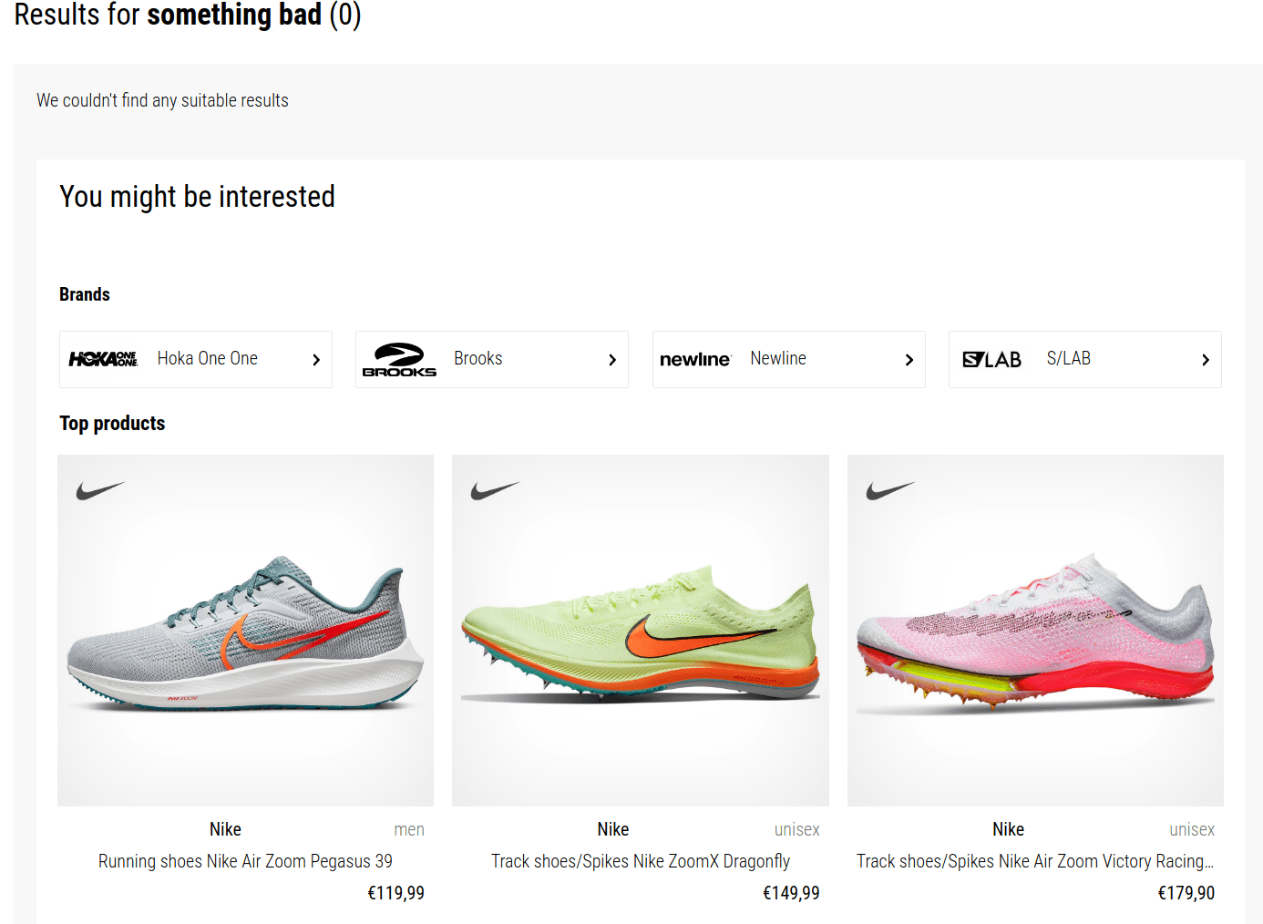
Top items
Section titled “Top items”Example TopItems configuration which will show 4 most popular items, 4 most popular categories and 4 most popular brands:
TopItems: ["item:4", "category:4", "brand:4"];Top items are the most “popular” products/categories/brands/etc. displayed when there are no results for the current query. It is simply a last-resort fallback that allows you to show at least some results instead of an empty page.
Following the universal syntax, TopItems specifier is composed of type and count: {type}:{count}
Default configuration is built from DefaultFilters.type and QuicksearchTypes.
Default filters
Section titled “Default filters”The DefaultFilters configuration option allows you to specify default filters that are sent along with each search request (unless the user overrides them).
You will most likely want to always specify a default for the type attribute to set which type to search by default. If you don’t set a default filter for type, search.js will search all your types by default and you will get a mix of products/categories/brands etc. in the results. To prevent this, set DefaultFilters: {type: 'item'} to instruct search.js to search only objects where type attribute is set to item.
DefaultFilters: { type: 'item', availability_rank: [1, 2, 5, 7]}DefaultFilters can be set for a subset of your attributes.
There are two modes of DefaultFilters:
- Default filters that are always sent on the background and the user doesn’t know about it and has no option to change their values. This is typically the case for the
typeattribute. - Default filter which the users can modify. To enable modifications, include the filter attribute in the
Facetsconfiguration. This will enable a facet for the attribute, but that facet will respect values from the DefaultFilters configuration as its default. Unless the user changes the facet values, the facet will respect DefaultFilters. Once the user changes values for the facet, search.js will respect the user selection until the search intent changes.
DefaultFilters: { type: 'item', availability_rank: [1, 2, 5, 7]},Facets: ['availability_rank']Following configuration will set default filters for the availability_rank attribute and limit the search results to objects where availability_rank is 1, 2, 5 or 7. By enabling availability_rank in Facets, search.js will render the availability_rank facet and pre-check some of the availability ranks, as specified by DefaultFilters.
Banners with custom (overridden) templates
Section titled “Banners with custom (overridden) templates”If you are overriding templates and banners campaigns are not rendering at all, make sure that you are referencing the <banner> components at the appropriate places.
Rendering results with the result template:
<result :result="result" v-for="(result, i) in results" :key="i" :index="i"></result>To override the result template (but not the banner template), override template-result-default.
| Banner type | Rendering mechanism |
|---|---|
| Header banner | Reference <banner position="header"></banner> in your custom template (most commonly in template-search). |
| Footer banner | Reference <banner position="footer"></banner> in your custom template (most commonly in template-search). |
| Side banner | Reference <banner position="panel"></banner> in your custom template (most commonly in template-search). |
| 5th result banner | Make sure you are rendering results via <result> component, which will make sure that the banner is rendered within results. |
Postponing data collection
Section titled “Postponing data collection”To ensure accurate price collection in situations where the standard price_amount attribute is not available, utilize the PostponeDataCollection method. This may occur when interacting with the pricing API, leading to the complete absence of the price_amount attribute or when a different attribute, such as price_en_amount, is used.
Without access to the price_amount attribute, collecting prices for results accurately becomes impossible. This, in turn, results in the inability to measure cart value at all.
When enabled, Search.js passes an emitAnalyticsEventFn callback to OnDone. You can use it after filling in the missing price_amount field, either from another indexed attribute or from a pricing API response.
PostponeDataCollection: true,OnDone(query, results, emitAnalyticsEventFn) {  results.forEach((result) => {    // Add custom logic to retrieve the correct price    result.attributes.price_amount = result.price_en_amount;  });
  emitAnalyticsEventFn();},
Pricing API integration
Section titled “Pricing API integration”If you are using different pricing levels depending on the signed-in user, one of the strategies that you can use to render correct user prices in search is using your pricing API.
Search.js is written in Vue.js and that means that you can use the concept of reactivity to re-render prices after you load them from your API.
OnDone(query, results) {  window.Luigis.Search.$app.$store.commit('setItgState', {    key: 'prices',    data: null,  });
  if (!results?.length) return;
  const ids = results    .map((result) => result.attributes.item_id)    .filter(Boolean);
  if (!ids.length) return;
  const apiUrl = new URL('https://www.example.com/pricing-api');  apiUrl.searchParams.set('ids', ids.join(','));
  fetch(apiUrl)    .then((response) => {      if (!response.ok) {        throw new Error(`Pricing API request failed with status ${response.status}`);      }
      return response.json();    })    .then((prices) => {      // Response format: {id1: 9.99, id2: 19.99}      window.Luigis.Search.$app.$store.commit('setItgState', {        key: 'prices',        data: prices,      });    })    .catch((error) => {      console.error('Failed to load Search.js prices.', error);    });},
Most of the logic lives in OnDone, where you collect result identifiers (using item_id in this example) and call your pricing API. Once the response arrives, you update the reactive itgState property and Vue.js re-renders the product tiles.
<div class="product-price"> <span v-if="itgState.prices && itgState.prices[attributes.id]"> {{ itgState.prices[attributes.id] | price }}</span > <span v-else> {{ attributes.price_amount | price }}</span></div>Template uses attributes.price_amount by default (feel free to use a loader element) and when the API call succeeds, Vue.js will automatically re-render component and use itgState.prices instead. You can use the xxx | price filter just like with price_amount.
Was this page helpful?
Thanks.