Autocomplete.js
We provide a JavaScript autocomplete widget which works directly with the JSON API. No programming is necessary, just include the script and CSS into your webpage and provide a simple configuration.
The library provides 3 built-in layouts which you can use out of the box.
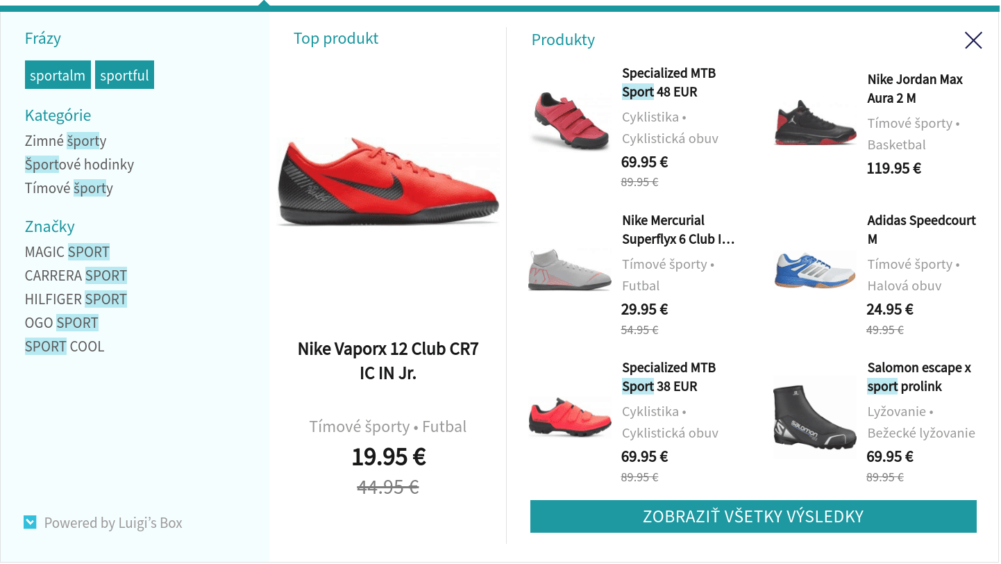
Hero layout (Recommended) — Shows a grid of products with one product standing out.
Line layout — Shows results in a top-down list. May be turned into 2 column layout.
Grid layout — Shows results in a grid. This layout is deprecated, consider using hero layout in grid mode.
Autocomplete integration
Section titled “Autocomplete integration”Add dns-prefetch instructions for browsers, for faster autocomplete experience and add autocomplete.css reference to your <head> element.
<link rel="dns-prefetch" href="//live.luigisbox.com" /><link rel="stylesheet" href="https://cdn.luigisbox.com/autocomplete.css" />Locate the HTML element of your search box, and add the initialization code after its input element.
<form> <input id="autocomplete" /> <!-- your search box --></form>function LBInitAutocomplete() { AutoComplete( { Layout: 'line', TrackerId: '1234-5678', Locale: 'en', Types: [ { type: 'item', name: 'Items', }, ], }, '#autocomplete' );}<script src="https://cdn.luigisbox.com/autocomplete.js" async onload="LBInitAutocomplete()"></script>You can configure the autocomplete widget to enable extra features. See Options reference for details and examples.
If you are using Cookiebot to manage cookie consent, we have seen cases where Cookiebot is interfering with the script onload event. If you initialize autocomplete via the onload event such as in the example above, the onload handler will never be executed. If you see this issue, try initializing via Cookiebot’s CookiebotOnTagsExecuted event.
<script src="https://cdn.luigisbox.com/autocomplete.js" async="async" />window.addEventListener('CookiebotOnTagsExecuted', function (e) { LBInitAutocomplete();});Autocomplete parameters
Section titled “Autocomplete parameters”AutoComplete object accepts 4 main parameters:
- REQUIRED — settings as a JSON object of the options.
- REQUIRED — selector of the
inputelement. - optional — HTML document.
- optional — Array of selectors to wait for before initializing autocomplete.js
function LBInitAutocomplete() { AutoComplete( { Layout: 'line', TrackerId: '1234-5678', Locale: 'en', Types: [ { type: 'item', name: 'Items', }, ], }, '#autocomplete', document, ['.selector-to-wait'] );}Content security policy
Section titled “Content security policy”If your website is using Content Security Policy, you need to add following rules to allow Luigi’s Box autocomplete.js to work.
| CSP directive | Value |
|---|---|
connect-src | https://live.luigisbox.com |
script-src | https://cdn.luigisbox.com |
style-src | https://cdn.luigisbox.com |
Options reference
Section titled “Options reference”The example below shows a more complex example of autocomplete setup. Consult the options reference below for explanations.
AutoComplete( { Layout: 'line', TrackerId: '1234-5678', Locale: 'en', Types: [ { type: 'item', name: '', size: 6, attributes: ['category.hl->1', 'brand.last', 'ean'], }, { type: 'category', name: 'Categories', size: 2, attributes: ['categories_hierarchy.last-1<-2'], }, { type: 'article', name: 'Articles', size: 2, }, ], Actions: [ { forRow: function (row) { return row.type === 'item'; }, iconUrl: 'https://www.myshop.com/assets/buy.png', title: 'Buy', action: function (e, result) { e.preventDefault(); $.post('/add-to-cart', { product_id: result.attributes.code }); }, }, ], Width: 500, }, '#autocomplete');AutoComplete accepts these options:
| Option | Comment | Example |
|---|---|---|
Layout REQUIRED string | String, which specifies what kind of layout will be used. Supported layouts are heromobile, hero, line or grid. If you do not specify this option, we will fallback to an obsolete layout, which is no longer supported and most of the features described here won’t work. | Layouts |
TrackerId REQUIRED string | Identifier of your site within Luigi’s Box. | |
Types REQUIRED array | List of content types which should be searched and displayed. Each content type must have a separate configuration. See Types parameters. | Types parameters |
Width optional number | Autocomplete width (px). If not set, the autocomplete widget will inherit width of the search box input element. | |
DidYouMean optional function | Function that gets called with three parameters input, matches and resultSetType, which returns a text information to show on the top of the search results to distinguish different match modes: exact match, fuzzy/partial match, or mixed match. | |
FollowSuggestedUrl optional boolean | Boolean indicating whether to redirect users to a url suggested by the server, which could be a matching category page or a Fixit url. (default: false) | |
CloseWhenQueryIsEmpty optional boolean | Boolean - by default true, if set to false, AutoComplete will not close when user clears input (with backspace for example) and top recommendations will be shown instead. | |
TypingSuggestions optional boolean | Boolean, if true, the searchbox will show simulated typing of example queries, drawing attention to the searchbox. | |
FormatForDisplay optional function | function(result), called for each result before it is displayed and provides a way to update result attributes when necessary, or to not display the result at all (return null). | |
Select optional function | function(event, result, row), called when result is selected (either by clicking or by keyboard selection). Allows custom action on selection - cancel the event by calling event.preventDefault and handle the selection yourself. | |
BeforeRender optional function | function(query, results), called before autocomplete widget is rendered and must return an array of results. | |
AfterRender optional function | function(query, results), called when autocomplete widget is rendered. | |
BeforeOpen optional function | Callback function, called before autocomplete widget is shown. It is called before the widget opens, for example, when you type the first letter into the search box which causes the widget to appear. | |
AfterClose optional function | Callback function, called after autocomplete widget is closed (either explicitly, or implicitly, because there are no results to be shown). | |
Actions optional array | Array of actions that may be applicable for a row. Each element of the array is an object with the following properties see Action properties. | |
Align optional string | String, with two options: input or center. Setting Align to center will keep the widget centered on the screen. Setting align to input will keep the widget’s left side aligned with the left side of the search box. Supported only in Grid layout. | |
GridPosition optional string | String, with two options: left or right. This option drives the column layout of the grid. Setting this option to left will place the “main” type (usually products) with images and prices on left side while the other types will be in the right column. With GridPosition: right the main type will be on the right side, and the other types in the left column. | |
ShowHeroProduct optional boolean | Boolean - by default true, specifies whether the hero product is displayed separately in its own wrapper. | |
ShowAllCallback optional function | Search-form submission callback. Useful if autocomplete should submit the searchbox in a non-standard way, for example when the enclosing form is missing. | |
AutoReposition optional boolean | Boolean, default false. When enabled, Autocomplete widget is recalculating its position based on the input field, to be nicely aligned in every situation (after resizing, scrolling…). | |
Locale REQUIRED string | If set, appropriate localisation patterns will be used. This is useful if your website has multiple language versions. | Localisation |
Translations optional object | Object used as dictionary, including locale keys and translation themselves. | Localisation |
HitFields optional array | Array of strings specifying which catalog attributes to include in the API response. Use this to reduce response size and improve performance. When not set or empty, all attributes are returned. | |
Prefer optional array | Array of key/value pairs to use for query-time boosting. | Query-time boosting |
PostponeDataCollection optional | Boolean indicating whether data collection should be postponed after the OnDone function is called | Postponing data collection |
Personalization optional | Boolean, default false. When enabled, it can drive personalization of results. The option will take effect only if personalization is also enabled on the backend. |
Types parameters
Section titled “Types parameters”| Types parameter | Comment | Example |
|---|---|---|
type REQUIRED string | Type identifier (e.g., item or category). | |
name REQUIRED string or function | Title shown at the top of the autocomplete section where items of this type will be shown. | |
size optional number | How many items of that particular type you want to show. | |
placement optional string | Position, where results will be placed. If one of the types has placement defined, it has to be defined in all other types. Only supported placement parameters are: main (items will be placed in the main section in Grid layout and wrapped with luigi-ac-main class), others (items will be placed in the sidebar section in Grid layout and wrapped with luigi-ac-others class). Placement is also supported in Line layout and is especially useful when using the 2-column variant. | |
attributes optional array | Array of attribute expressions which will be evaluated to show item attributes alongside its title. Supported only in Line layout. See the Attribute expressions section. | |
recommend optional object | Display autocomplete section populated by most popular items when user clicks into the search field without typing a query. Value is an object which may contain name and size keys for specifying different name at the top of the section and how many top items to display. If you use an empty object, name and size values will be inherited from the parent type configuration. | |
defaultFilters optional | Object with key/value pairs, representing the filters to apply when querying for autocomplete suggestions. | Filtering in autocomplete |
filters optional | Custom function which must return key/value pairs, representing the filters to apply when querying for autocomplete suggestions. | Filtering in autocomplete |
Action properties
Section titled “Action properties”| Actions property | Comment |
|---|---|
forRow optional function | function(row) which must return a boolean indicating if the action is applicable for the given row (passed as a function parameter). If this function returns false than all other parameters have no effect. |
iconUrl optional string | Full URL address of an image that will appear as the action icon. We recommend using a 60x60 px PNG image with transparent background. |
title optional string | Text that will appear on mouseover action over the icon. |
action optional function | function(event, result), called when user clicks the icon. This function is passed 2 arguments, the JavaScript event and the result object. It is a responsibility of this function to do the necessary work, for example, put item to cart. |
Returning self reference
Section titled “Returning self reference”The AutoComplete constructor returns references to all created widgets, so you can access its public functions and options. The references are returned as an array, one object for each HTML selector that was matched by the provided input box selector.
var ac = AutoComplete(  {    Layout: 'line',    TrackerId: '1234-5678',    Locale: 'en',    Types: [      {        type: 'item',        name: '',        size: 6,      },    ],  },  '#autocomplete');
ac[0].Close();ac[0].Reposition();
Public functions
Section titled “Public functions”AutoComplete widget provides these public functions. You’ll need to obtain a reference to the widget first, before you can call these functions.
| Function | Comment |
|---|---|
Reposition function | Reposition the widget and align it with your search input box. You don’t need to call this function under normal circumstances. A typical use case for this function is when your website layout changes due to a user interaction and you need to reposition the autocomplete widget. A case we see quite often is that you have a fixed “bar” at the top of the page with a notification which the user can close. This can lead to a situation where a user types query into the search box, the autocomplete widget renders itself aligned under the bottom, and then the user closes the notification bar, which causes the page content to shift a few pixels up, and suddenly the widget is not aligned properly. In this case, you can call the Reposition() function when the bar is closed to fix the alignment. |
OpenEmpty function | Opens an empty widget, with just the bare UI. You must provide your own HTML which will be rendered as the body of the autocomplete. This is useful in situation where you want to render the autocomplete widget with your custom content and keep all the standard behaviour and listeners active. |
Destroy function | Destroys the widget, removes event listeners and drops caches. This function is useful mostly for SPAs where you need to reconfigure the widget between page loads, or remove the autocomplete completely for certain pages. |
Layouts
Section titled “Layouts”We provide these built-in layouts:
| Layout | Comment |
|---|---|
| Hero | Specify Layout: 'hero' or Layout: 'heromobile' for a responsive mobile version. |
| Line | Specify Layout: 'line'. |
| Grid | Specify Layout: 'grid'. |
Shared public CSS classes
Section titled “Shared public CSS classes”| Class | Comment |
|---|---|
luigi-ac-main | Wraps the (visually) “main” section of the widget. See Placement of items for more details. |
luigi-ac-others | Wraps the (visually) less important section of the widget. See Placement of items for more details. |
luigi-ac-item | All “rows” in autocomplete widget are wrapped in this class. |
luigi-ac-header | Wraps results header. |
luigi-ac-product | Class for each product. |
luigi-ac-category | Class for each item which is not a product or query. |
luigi-ac-query | Class for each item which is type query. |
luigi-ac-image | Class for each item’s image. |
luigi-ac-title or luigi-ac-text | Class for each item’s title. |
luigi-ac-attrs | Wraps attributes. |
luigi-ac-attr | Class for each attribute. |
luigi-ac-price | Wraps price of an item. |
luigi-ac-button | Wraps button block for ‘Show All Items’. |
Hero layout
Section titled “Hero layout”AutoComplete( { Layout: 'hero', TrackerId: '1234-5678', Locale: 'en', ShowHeroProduct: true, Types: [ { type: 'item', placement: 'main', size: 7, attributes: ['category'], }, { type: 'query', size: 4, placement: 'others' }, { type: 'category', size: 3, placement: 'others', }, { type: 'brand', size: 5, placement: 'others', }, ], }, '#luigi-ac-input');
Hero public CSS classes
Section titled “Hero public CSS classes”| Class | Comment |
|---|---|
luigi-ac-hero | Wraps the autocomplete widget for Hero layout. |
luigi-ac-hero-color | Class for styling queries and caret with top strip. Basically this class defines main color of this layout. |
luigi-ac-hero-color-clickable | Class for styling “show all products” button and queries rectangles. |
luigi-ac-actions and luigi-ac-action | Wraps actions like ‘Buy’ or ‘Sell’. |
luigi-ac-first-main | Wrapper for “Hero product” - the first one appeared. |
luigi-ac-rest-main | Wrapper for all other products except “Hero product”. |
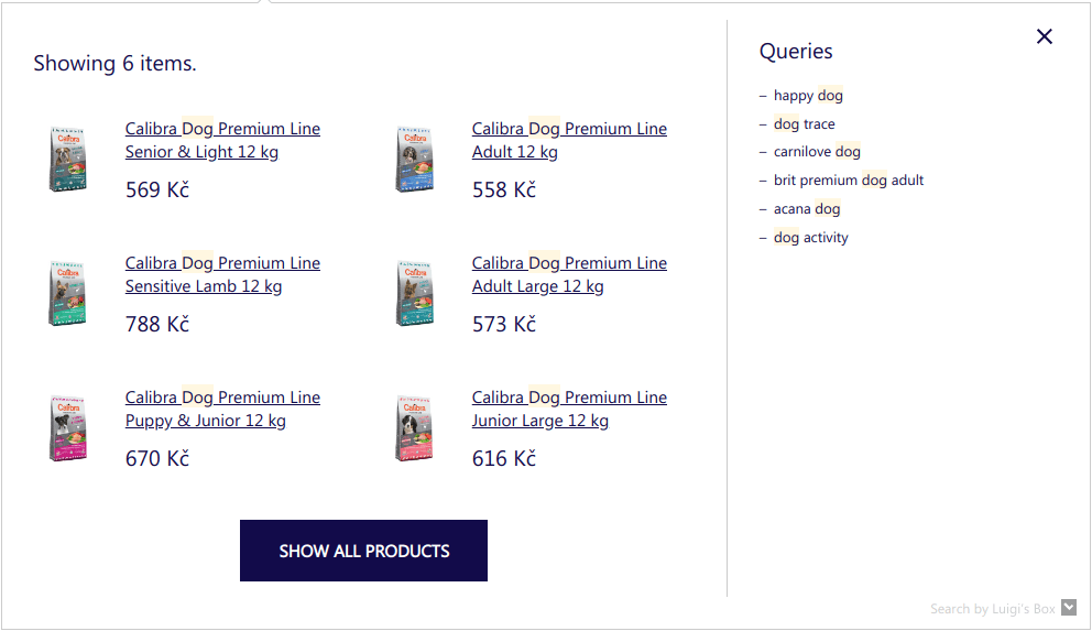
Line layout
Section titled “Line layout”AutoComplete( { Layout: 'line', TrackerId: '1234-5678', Locale: 'en', Types: [ { type: 'item', name: 'Items', }, { type: 'category', name: 'Categories', }, ], }, '#luigi-ac-input');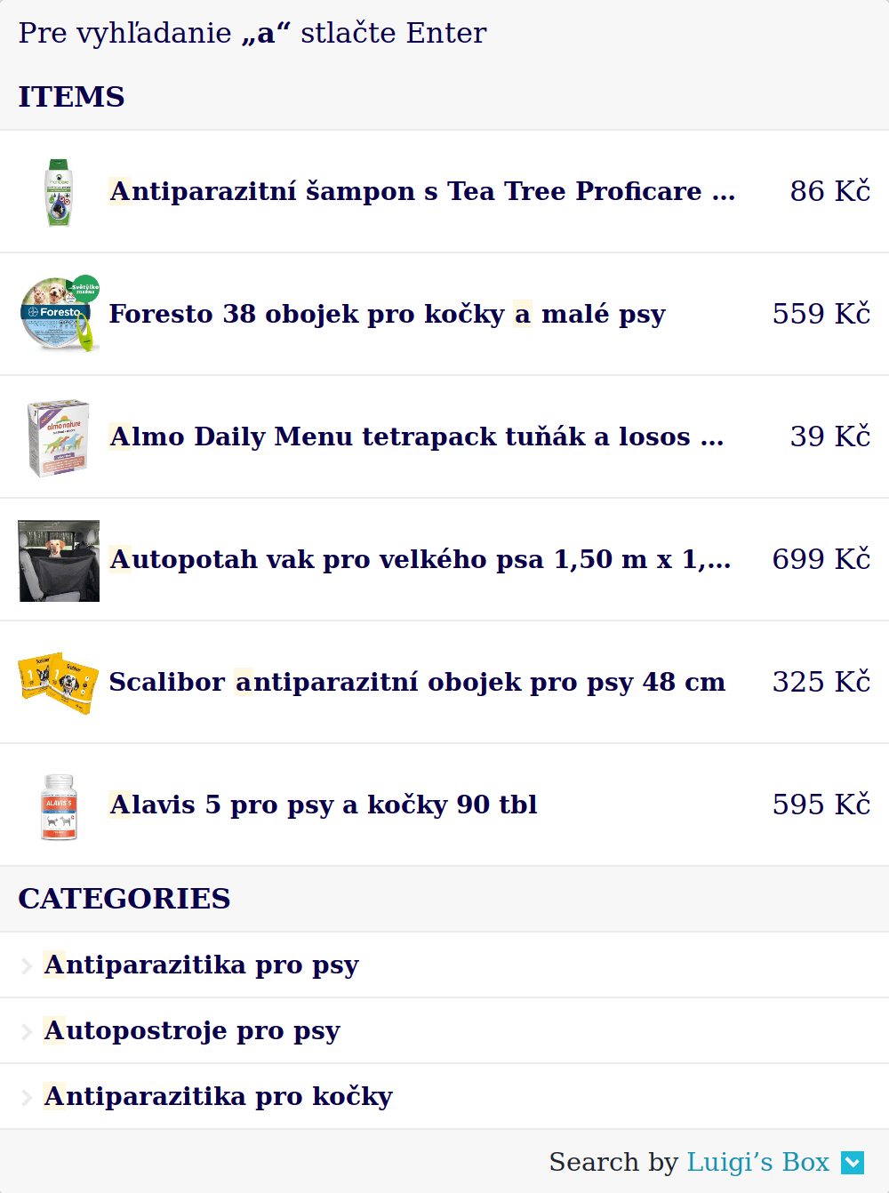
Line public CSS classes
Section titled “Line public CSS classes”| Class | Comment |
|---|---|
luigi-ac-line | Wraps the autocomplete widget for Line layout. |
luigi-ac-actions and luigi-ac-action | Wraps actions like ‘Buy’ or ‘Sell’. |
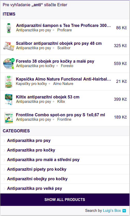
Grid layout
Section titled “Grid layout”Grid layout consists of two parts — a main “grid” part with images and prices, and an additional, more condensed column.
AutoComplete( { Layout: 'grid', ShowBranding: true, TrackerId: '1234-5678', Locale: 'en', Types: [ { type: 'item', name: 'Products', }, { type: 'category', name: 'Categories', }, ], }, '#luigi-ac-input');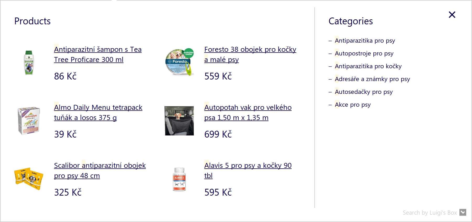
Grid public CSS classes
Section titled “Grid public CSS classes”| Class | Comment |
|---|---|
luigi-ac-grid | Wraps the autocomplete widget for Grid layout. |
Position of grid layout
Section titled “Position of grid layout”This can be done by defining GridPosition: left or GridPosition: right as autocomplete widget’s option.
Default position of grid is left, that means, that items with defined placement: 'main' are on left side, but you can explicitly define that state.
If placement is not defined, then first specified type is considered main and will be on the left side. Other types will be on the right side.
Grid layout autocomplete with GridPosition: ‘left’
AutoComplete( { Layout: 'grid', ShowBranding: true, GridPosition: 'left', TrackerId: '1234-5678', Locale: 'en', Types: [ { type: 'item', placement: 'main', name: 'Products', }, { type: 'category', name: 'Categories', }, { type: 'query', name: 'Queries', }, ], }, '#luigi-ac-input');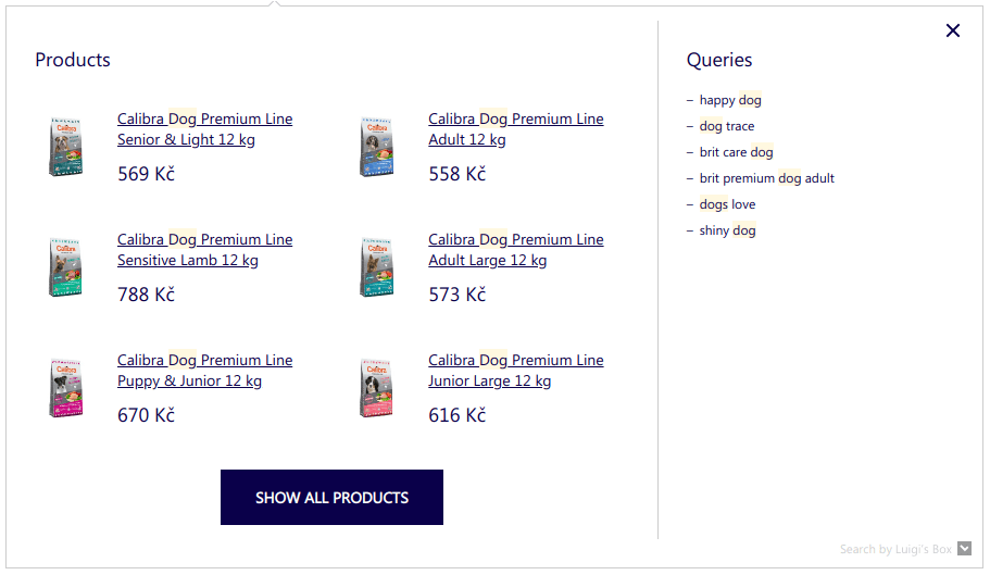
Grid layout autocomplete with GridPosition: ‘right’
AutoComplete( { Layout: 'grid', ShowBranding: true, GridPosition: 'right', TrackerId: '1234-5678', Locale: 'en', Types: [ { type: 'item', placement: 'main', name: 'Products', }, { type: 'category', name: 'Categories', }, { type: 'query', name: 'Queries', }, ], }, '#luigi-ac-input');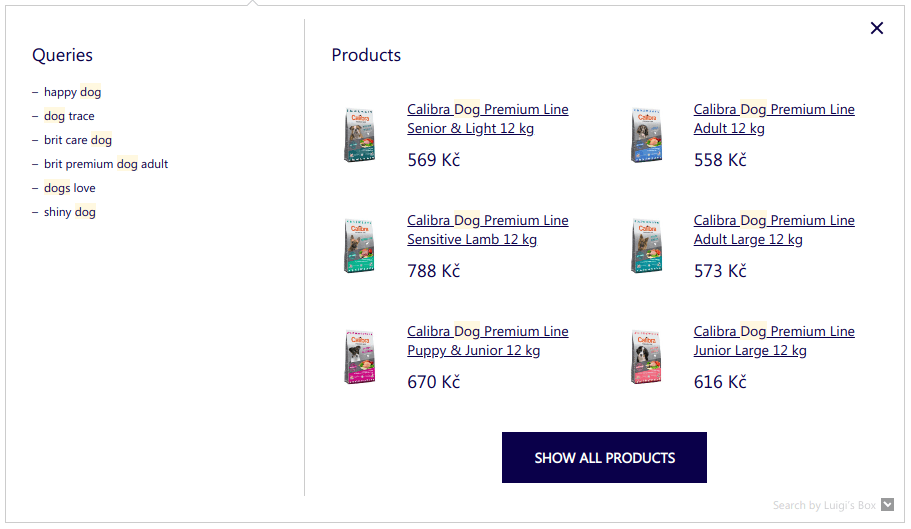
Align grid to center or with search box
Section titled “Align grid to center or with search box”This can be done by defining Align: 'center' or Align: 'input' as autocomplete widget’s option.
Default state of Grid layout is Align: center.
If you want to move the autocomplete along with input search box, set Align: 'input', otherwise it will be centered on the page.
Grid layout autocomplete with Align: ‘input’ — the left side of the autocomplete is aligned same as input search box.
AutoComplete( { Layout: 'grid', ShowBranding: true, TrackerId: '1234-5678', Locale: 'en', Align: 'input', Types: [ { type: 'item', placement: 'main', name: 'Products', }, ], }, '#luigi-ac-input');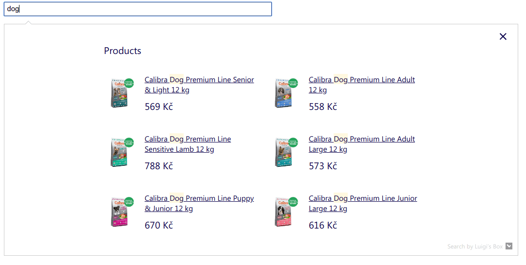
Grid layout autocomplete with Align: ‘center’ — the autocomplete is centered on the page.
AutoComplete( { Layout: 'grid', ShowBranding: true, TrackerId: '1234-5678', Locale: 'en', Align: 'center', Types: [ { type: 'item', placement: 'main', name: 'Products', }, ], }, '#luigi-ac-input');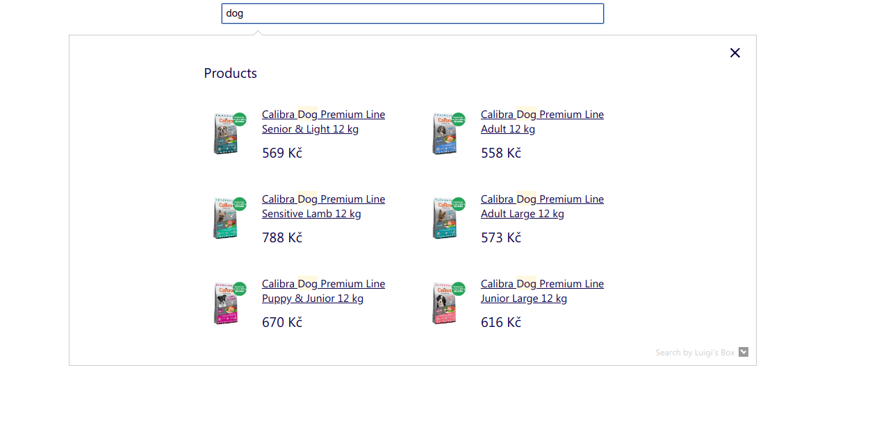
Placement of items
Section titled “Placement of items”Supported in Grid Layout and Line Layout.
This can be done by defining placement: 'main' or placement: 'others' parameter in Types. These are the only two supported placements.
Note that if it is used for one of the Types, it has to be defined for all other Types to have an effect.
If placement is not defined, then first specified type or type ‘item’ is considered “main” and will be wrapped with luigi-ac-main class.
If placement is defined, then items set to placement: main will be wrapped with luigi-ac-main class. Note that these items expect images.
If placement is defined, then items set to placement: others will be wrapped with luigi-ac-others class.
Grid layout autocomplete with custom placement of “item” and “category” in the middle
AutoComplete( { Layout: 'grid', ShowBranding: true, TrackerId: '1234-5678', Locale: 'en', Types: [ { type: 'item', placement: 'main', }, { type: 'category', placement: 'main', name: 'Categories', }, { type: 'query', placement: 'others', name: 'Queries', }, ], }, '#luigi-ac-input');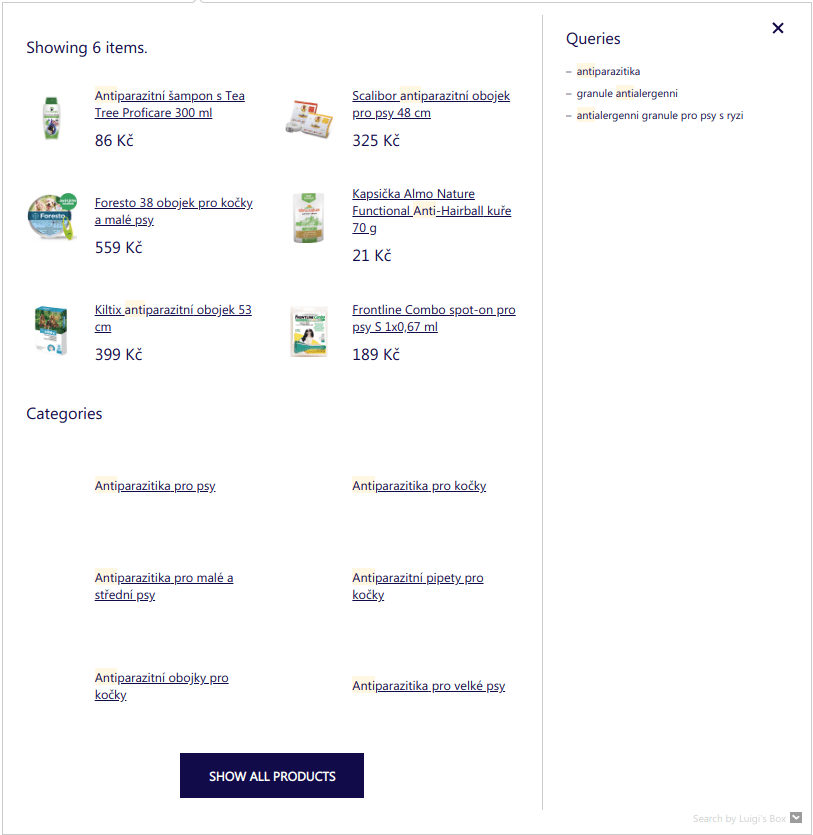
Grid layout autocomplete with custom placement of all Types in the middle
AutoComplete( { Layout: 'grid', ShowBranding: true, TrackerId: '1234-5678', Locale: 'en', Types: [ { type: 'item', placement: 'main', }, { type: 'category', placement: 'main', name: 'Categories', }, { type: 'query', placement: 'main', name: 'Queries', }, ], }, '#luigi-ac-input');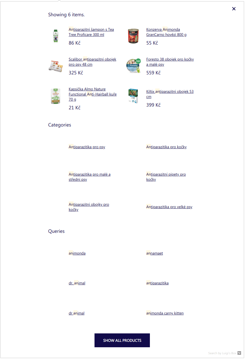
Attribute expressions
Section titled “Attribute expressions”Supported in Grid Layout and Line Layout.
Attribute expressions allow you to specify which item attributes will be shown in the second line of a single autocomplete row.
A generic form of attribute expression is attribute.start->after<-behind.
Attribute expressions operate on arrays of values and consist of 4 parts:
| Part | Comment |
|---|---|
| attribute REQUIRED | Which attribute will be shown in autocomplete |
| start optional | Required, when you want to define behind or after context. So attribute->10<-5 is not valid. |
| behind context optional | Consist of <- and positive number. |
| after context optional | Consist of -> and positive number. |
-> delimits after context and <- delimits behind context.
For example, expression category.hl->1<-1 operating on ['Electronics', 'Smart <em>TV</em>', 'LED', '50"'] will find the first highlighted value (i.e. the value which matched the query) and take one value after it and one value before it. In this case, the result would be Electronics, Smart <em>TV</em>, LED shown in the second line, under the item’s title.
Autocomplete for showing one highlighted category, last brand and second to last category from hierarchy:
AutoComplete( { Layout: 'line', TrackerId: '1234-5678', Locale: 'en', Types: [ { type: 'item', name: 'Items', attributes: ['category.hl', 'brand.last', 'categories.hierarchy.last-1'], }, ], }, '#luigi-ac-input');For start value, you can use one of the following:
| Value | Comment | Example |
|---|---|---|
| a number | interpreted as an index into the value array. First value is indexed as 0. | category.1 |
hl | which is interpreted as index of highlighted value, or index of last value if nothing was highlighted. | category.hl |
last | index of last value | category.last |
last-1 | index of second to last value | category.last-1 |
Some notes on edge cases and limitations:
- if you specify non-existent attribute name, that expression will be skipped
- if you specify start position which is out of bounds for the current item, that expression will be skipped
- behind or after context will never go out of bounds, if you write
category.0->1000this will show all category values and is equivalent to just writing (category)
Localisation
Section titled “Localisation”AutoComplete( { Layout: 'hero', TrackerId: '1234-5678', Locale: 'en', // current language of website Translations: { en: { // override translations you want to change showAllTitle: 'Show me more!', showBuyTitle: '', // set to empty string to disable button priceFilter: { minimumFractionDigits: 0, maximumFractionDigits: 2, locale: 'en', prefixed: true, symbol: '$', }, }, // you can define your own language and use it in Locale option esperanto: { // define all translations // ... }, }, }, '#luigi-ac-input');To customize texts and settings depending on language version of your website, you can use Locale and Translations options.
First step is to set Locale option to string containing locale key. We provide default dictionaries for following languages: en, de, sk, cz, pl, hu, ro. You can also define your own locale in Translations option and use it.
Translations option should be object with locales keys, each locale key containing dictionary for specific language. This object will be merged with our default translations, so you need to specify only translations you want to override. If you are using custom locale key, you need to define all translations.
Default dictionary for English (use it as reference for overriding / creating dictionaries):
{ "showAllTitle": "Show all products", "showBuyTitle": "Add to basket", "placeholderText": "Search for...", "hint": "Press Enter to search for :query", "noResultsMessage": "Your search term :query did not match any of our products. Please try another search term.", "noResultsMessageOne": "We only found one product for query :query.", "types": { "item": { "name": "Products", "recommendHeroName": "Top products", "heroName": "Top product", "recommendName": "Top product" }, "query": { "name": "Queries", "recommendName": "Top queries" }, "category": { "name": "Categories", "recommendName": "Top categories" }, "brand": { "name": "Brands", "recommendName": "Top brands" }, "article": { "name": "Articles", "recommendName": "Top articles" } }, "priceFilter": { "minimumFractionDigits": 0, "maximumFractionDigits": 2, "locale": "en", "prefixed": true, "symbol": "$" }}Filtering in autocomplete
Section titled “Filtering in autocomplete”defaultFilters option
Section titled “defaultFilters option”You can explicitly set filters to scope autocomplete results to only when the specified attributes match the provided values. You can specify as many attributes and as many values as necessary. The provided value of the attribute can be either a scalar, or an array. If you specify an array, the request is interpreted such that all individual values from the array must match for the result to match.
This filtering is similar to what you can achieve with autocomplete contexts, but unlike contexts, it does not require any changes on your part in how you index the data.
AutoComplete( { Layout: 'grid', TrackerId: '1234-5678', Locale: 'en', Types: [ { type: 'item', name: 'Products', defaultFilters: { category: 'her', set: ['summer dress', 'skirts'], }, }, { type: 'category', name: 'Category', }, ], }, '#luigi-ac-input');filters option
Section titled “filters option”You can use your own code to define logic for using filters in autocomplete. Functionality is the same as defaultFilters, but this is dynamic.
AutoComplete( { Layout: 'grid', TrackerId: '1234-5678', Locale: 'en', Types: [ { type: 'item', name: 'Products', filters: function () { var customFilters = { category: 'her', set: ['summer dress', 'skirts'], }; return customFilters; }, }, { type: 'category', name: 'Category', }, ], }, '#luigi-ac-input');Pricing API integration
Section titled “Pricing API integration”If you are using different pricing levels depending on the signed-in user, one of the strategies that you can use to render correct user prices in autocomplete is using your pricing API.
Start by defining a loader element which will render instead of prices:
.loader {  border: 16px solid #f3f3f3;  border-radius: 50%;  border-top: 16px solid #3498db;  width: 20px;  height: 20px;  -webkit-animation: spin 2s linear infinite;  animation: spin 2s linear infinite;  position: absolute;  left: 50%;}
@-webkit-keyframes spin {  0% { -webkit-transform: rotate(0deg); }  100% { -webkit-transform: rotate(360deg); }}
@keyframes spin {  0% { transform: rotate(0deg); }  100% { transform: rotate(360deg); }}
Hide the prices in autocomplete via CSS:
.luigi-ac .luigi-ac-price-new { visibility: hidden;}And display the loading indicator:
FormatForDisplay: function(result) {  if (result && result.attributes && result.attributes.price_amount) {    result._after_price = "<div class='loader'></div>"  }
  return result;}
If the products in your catalog don’t have a price attribute, make sure to add a placeholder for the price:
FormatForDisplay: function (result) { if (result && result.attributes && !result.attributes.price) { result.attributes.price = " "; result._after_price = "<div class='loader'></div>"; }
return result;}In order to have the .luigi-ac-attr--id element available in the product tile, configure it in attributes for the type:
AutoComplete( { Layout: 'line', TrackerId: '1234-5678', Locale: 'en', Types: [ { type: 'item', name: 'Items', attributes: ['id'], }, ], }, '#luigi-ac-input');Hide the ids in autocomplete via CSS:
.luigi-ac .luigi-ac-attrs .luigi-ac-attr.luigi-ac-attr--id { display: none;}When autocomplete widget renders, fire an XHR request to your pricing API and use the result to replace the loaders with per-customer prices. This code assumes that the pricing API response is an object where the keys are product IDs, and values are fully-formatted prices.
AfterRender: function(query, results) {  if (results && results.length > 0) {    var renderedResults = document.querySelectorAll('.luigi-ac-product');
    // collect IDs of the found products, here, we are using the id attribute    var ids = [];    results.forEach(function(result) {        if (result.attributes.id) {            ids.push(result.attributes.id)        }    })
    var xhttp = new XMLHttpRequest();    xhttp.onload = function() {        var jsonParsed = JSON.parse(this.responseText);
        // Update the HTML for each result with the price from the pricing API        renderedResults.forEach(function(result) {            var productId = result.querySelector('.luigi-ac-attr--id').textContent;            if (jsonParsed[productId]) {                result.querySelector('.luigi-ac-price-new').innerText = jsonParsed[productId];            }        })
        // Show the (now updated) prices        var prices = document.querySelectorAll('.luigi-ac-price-new');        for (var i = 0; i < prices.length; i++) {            prices[i].style.visibility = 'visible';        }
        // Hide the loaders        var loaders = document.querySelectorAll('.luigi-ac .loader');        for (var i = 0; i < loaders.length; i++) {            loaders[i].style.display = 'none';        }    }
var apiUrl = 'https://yourdomain.example/api/pricing?ids='+ids.join(','); xhttp.open("GET", apiUrl); xhttp.send(); }}Compatibility
Section titled “Compatibility”Luigi’s Box autocomplete widget is compatible with all modern browsers, however, some third-party scripts are known to cause problems.
Mootools
Section titled “Mootools”Mootools is overriding a native Function.prototype.bind function in an incompatible way. If you try to use Luigi’s Box autocomplete widget on a website that is using Mootools, the widget will not work.
You can however use a simple workaround and save the original bind function, before you load Mootools. Put this script tag <script>window._bind = Function.prototype.bind;</script> before the script tag that loads mootools. It will save the original bind function into a _bind variable. If we detect that your website is using Mootools, we will automatically fallback to this _bind function and the widget will work.
Postponing data collection
Section titled “Postponing data collection”To ensure accurate price collection in situations where the standard price_amount attribute is not available, utilize the PostponeDataCollection method. This may occur when interacting with the pricing API, leading to the complete absence of the price_amount attribute.
Without access to the price_amount attribute, schema.org annotations are generated without information about the price, resulting in the inability to collect prices for autocomplete results. Consequently, this leads to an inability to measure cart value at all.
Upon activation, it employs an emitAnalyticsEventFn callback function passed to the afterRender function. This enables you to add the missing schema.org annotation in the afterRender with a price obtained from the pricing API response.
The following code example refers to the example in pricing API:
PostponeDataCollection: true,AfterRender: function(query, results, emitAnalyticsEventFn) { // Update the HTML for each result with the price from the pricing API renderedResults.forEach(function(result) { var productId = Number(result.querySelector('.luigi-ac-attr--id').textContent) if (jsonParsed[productId]) { result.querySelector('.luigi-ac-price-new').innerText = jsonParsed[productId]; // Add missing schema.org annotations to the price element const priceElement = result.querySelector('.luigi-ac-price'); priceElement.setAttribute('itemprop', 'offers'); priceElement.setAttribute('itemtype', 'http://schema.org/Offer'); priceElement.setAttribute("itemscope", ""); // Append the missing meta tag with the correct price const priceTagMarkup = `<meta itemprop="${jsonParsed[productId]}" content="129">`; priceElement.insertAdjacentHTML('afterbegin', priceTagMarkup); } }) // Call the emitAnalyticsEventFn once the schema.org annotations are complete emitAnalyticsEventFn()}Was this page helpful?
Thanks.